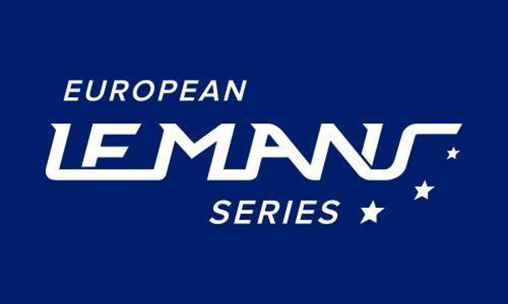
The European Le Mans Series will have a new identity, having revealed a revised logo for this year’s championship.
The logo was created to “reflect the dynamism” of the series and provide an “instantly recognizable” brand for competitors, media and fans, according to championship organizers.
It was also designed to be used with ease across various digital platforms and TV production.
“A logo is a very important part of the identity of a brand,” said series boss Gerard Neveu.
“The new ELMS logo is simple yet easily recognizable and dynamic.
“It is a modern design evoking the very important tradition of endurance competition. We hope that it will receive a warm welcome from our fans and those who follow us.”
The six-round championship kicks off at Paul Ricard in April.


